
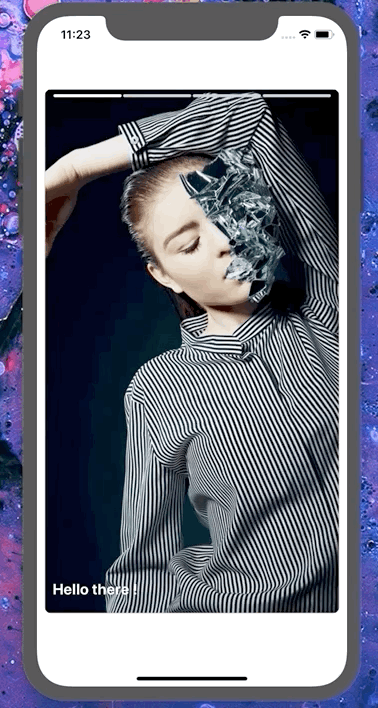
MediaCard
Tinder like Media Card componet
Usage
import React, { useState } from 'react'
import { View, Text } from 'react-native'
import { MediaCard } from 'nottinderuikit'

const SampleMediaCard = () => {
  // Sample Array of images from Unsplash
  const images = [
    {
      uri:
        'https://images.unsplash.com/photo-1586470208442-67c5c1abbc78?ixlib=rb-1.2.1&auto=format&fit=crop&w=933&q=80',
    },
    {
      uri:
        'https://images.unsplash.com/photo-1516908205727-40afad9449a8?ixlib=rb-1.2.1&ixid=eyJhcHBfaWQiOjEyMDd9&auto=format&fit=crop&w=935&q=80',
    },
    {
      uri:
        'https://images.unsplash.com/photo-1586557009709-63ac91998176?ixlib=rb-1.2.1&ixid=eyJhcHBfaWQiOjEyMDd9&auto=format&fit=crop&w=975&q=80',
    },
    {
      uri:
        'https://images.unsplash.com/photo-1520271348391-049dd132bb7c?ixlib=rb-1.2.1&ixid=eyJhcHBfaWQiOjEyMDd9&auto=format&fit=crop&w=934&q=80',
    },
  ];
  // Here we manage the current image by it's index
  const [currentIndex, setCurrentIndex] = useState(0);
  const nextImage = (n: number, length: number) => {
    const nextIndex = n + currentIndex;
    if (nextIndex >= 0 && nextIndex < length) {
      setCurrentIndex(nextIndex);
    }
  };

  return <View
    style={{
      height: '80%',
      width: '100%',
    }}
  >
    <MediaCard
      leftLabel='Yup'
      rightLabel='Nope'
      downLabel='super yup'
      images={images}
      currentImageIndex={currentIndex}
      handleCurrentImageChange={nextImage}
      onBottomPress={() => {
        console.log('bottom press');
      }}
      bottomData={
        <Text style={{ color: '#FFF', fontWeight: 'bold', fontSize: 20 }}>
          Hello there !
        </Text>
      }
    />
  </View>

}

export default SampleMediaCard
Props
imageshandleCurrentImageChangecurrentImageIndexleftLabelrightLabeldownLabelonBottomPressbottomDatapositionXY
Reference
images
Array of images uri objects with the following shape: { uri:"" }
| Type | Default | Required |
|---|---|---|
| Array: { uri: string }[] | undefined | true |
handleCurrentImageChange
Function executed when the current image index changes, it will be called with one parameter 1 if the media card is pressed on the right and -1 if it is pressed on the left side.
| Type | Default | Required |
|---|---|---|
| function: (n:number)=> any | undefined | true |
currentImageIndex
Curren image index.
| Type | Default | Required |
|---|---|---|
| number | 0 | false |
leftLabel
Label shown on the left side of the card when is being swiped right.
NOTE: To make this label bisible you'll have to use MediaCard component wrapped with SwipeableWrapper
| Type | Default | Required |
|---|---|---|
| string | "" | false |
rightLabel
Label shown on the right side of the card when is being swiped right.
NOTE: To make this label bisible you'll have to use MediaCard component wrapped with SwipeableWrapper
| Type | Default | Required |
|---|---|---|
| string | "" | false |
downLabel
Label shown on the down side of the card when is being swiped right.
NOTE: To make this label bisible you'll have to use MediaCard component wrapped with SwipeableWrapper
| Type | Default | Required |
|---|---|---|
| string | "" | false |
onBottomPress
Function called whtn the bottom side of the card is pressed.
| Type | Default | Required |
|---|---|---|
| function: ()=> any | ()=>{} | false |
bottomData
Component shown on the bottom of the card.
| Type | Default | Required |
|---|---|---|
| ReactNode | undefined | false |
positionXY
Animated value of the media card position X Y. See the sample on the SwippeableWrapper
| Type | Default | Required |
|---|---|---|
| React.Animated.valueXY | undefined | false |