
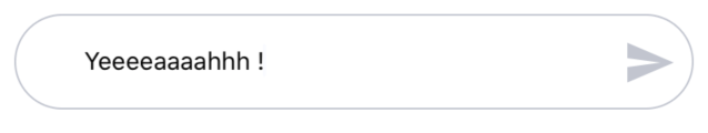
ChatInput
A tinder like chat input
Usage
import React, { useState } from 'react';
import { MaterialIcons } from '@expo/vector-icons'
import { colors, ChatInput } from 'nottinderuikit'
const SimpleChatInput = () => {
  const [value, setValue] = useState('');
  const sendIcon = <MaterialIcons name='send' size={30} color={colors.darkGrey} />;
  const handleSend = () => {
    console.log(value);
    setValue('');
  }

  return <ChatInput
    value={value}
    handleChangeText={setValue}
    handleSend={handleSend}
    sendIcon={sendIcon}
  />
}

export default SimpleChatInput;
Props
Reference
value
Value of the input.
| Type | Default | Required |
|---|---|---|
| string | undefined | true |
handleChangeText
Function called when the text on the input changes.
| Type | Default | Required |
|---|---|---|
| function: (nextValue: string) => void | undefined | true |
handleSend
Function called when send is pressed.
| Type | Default | Required |
|---|---|---|
| function: ()=> void | undefined | false |
sendIcon
Send message icon.
| Type | Default | Required |
|---|---|---|
| ReactNode | false |