
AddRemoveImage
Tinder like add remove image component
| No imageSource provided | imageSource provided |
|---|---|
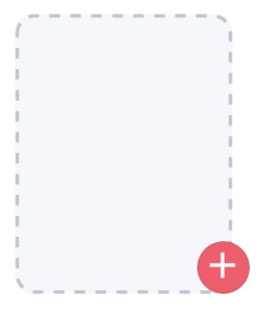 | 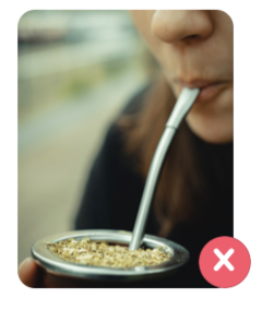 |
Usage
// src/AddRemove.tsx
import React, { useState } from 'react';
import { AddRemoveImage } from 'nottinderuikit';
import { MaterialCommunityIcons, Entypo } from '@expo/vector-icons';

const AddRemove = () => {
  const [imageSource, setImageSource] = useState<undefined | { uri: string }>()
  const removeIcon = <Entypo name='cross' size={25} color='white' />;
  const addIcon = (
    <MaterialCommunityIcons name='plus' size={25} color='white' />
  );
  const saveImage = (id: string) => {
    // Here you upload your image to your server
    // We just log the image id and set an imageSource 😄
    console.log(`Uploading image ${id}`);
    const uri = 'https://images.unsplash.com/photo-1585744134783-ae8804f900dc?ixlib=rb-1.2.1&ixid=eyJhcHBfaWQiOjEyMDd9&auto=format&fit=crop&w=933&q=80';
    setImageSource({ uri });
  }
  const removeImage = (id: string) => {
    // Here you delete your image from your server
    // We just log the image id and unset the imageSource
    console.log(`Removing image ${id}`);
    setImageSource(undefined);
  }
  const sampleId = 'Image-1';


  return <AddRemoveImage
    addIcon={addIcon}
    addImage={saveImage}
    removeIcon={removeIcon}
    removeImage={removeImage}
    imageSource={imageSource}
    id={sampleId}
  />
}

export default AddRemove
Props
Reference
id
Identifier of the file, this value is pased as a parameter on addCallback and removeCallback.
| Type | Default | Required |
|---|---|---|
| string | undefined | true |
addIcon
We didn't include icons as part of the library, in this example we used the ones provided by
@expo/vector-icons
Icon shown on the bottom right of the component when there's no imageSource provided.
| Type | Default | Required |
|---|---|---|
| ReactNode | undefined | true |
addCallback
Function called when the component is pressed and there's no imageSource.
| Type | Default | Required |
|---|---|---|
| function: ( id: string ) => any | undefined | true |
removeIcon
We didn't include icons as part of the library, in this example we used the ones provided by
@expo/vector-icons
Icon shown on the bottom right of the component when there is imageSource provided.
| Type | Default | Required |
|---|---|---|
| ReactNode | undefined | true |
removeCallback
Function called when the removeIcon is pressed.
| Type | Default | Required |
|---|---|---|
| function: ( id: string ) => any | undefined | true |
imageSource
Source object of the image
| Type | Default | Required |
|---|---|---|
| object: { uri: string } | undefined | false |
height
Height of the AddRemoveImage component
| Type | Default | Required |
|---|---|---|
| number | 150 | false |
width
Width of the AddRemoveImage component
| Type | Default | Required |
|---|---|---|
| number | 100 | false |