
ChatBubble
ChatBubble
Usage
import React from 'react'
import { View } from 'react-native'
import { ChatBubble } from 'nottinderuikit'
const ChatSample = () => {
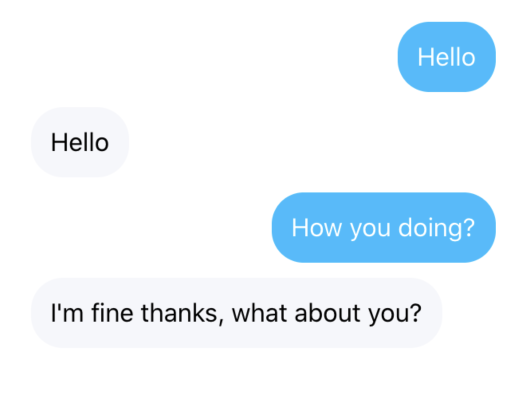
return <View style={{ width: "80%", paddingHorizontal: 20 }}>
<ChatBubble
text="Hello"
id="1223"
/>
<ChatBubble
text="Hello"
id="1224"
isInbound
/>
<ChatBubble
text="How you doing?"
id="1225"
/>
<ChatBubble
text="I'm fine thanks, what about you?"
id="1226"
isInbound
/>
</View>
}
export default ChatSample
Props
Reference
id
Message id
| Type | Default | Required |
|---|---|---|
| string | undefined | true |
text
Text to be displayed
| Type | Default | Required |
|---|---|---|
| string | undefined | true |
isInbound
The components we want to wrap into the Card
| Type | Default | Required |
|---|---|---|
| boolean | undefined | false |