
Avatar
Simple rounded Avatar
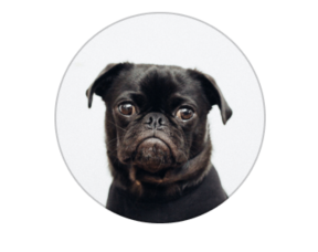
Usage
import React from 'react'
import { Avatar } from 'nottinderuikit'

const SimpleAvatar = () => {
  const uri = 'https://images.unsplash.com/photo-1537815749002-de6a533c64db?ixlib=rb-1.2.1&auto=format&fit=crop&w=1445&q=80';
  return <Avatar source={{ uri }} size={120} />
}

export default SimpleAvatar
Props
Reference
source
Source object of the image
| Type | Default | Required |
|---|---|---|
| object: { uri: string } | undefined | true |
size
Size of the avatar, this value is going to be set as the height and width.
| Type | Default | Required |
|---|---|---|
| number | 60 | false |
style
Add aditional styles to the component.
| Type | Default | Required |
|---|---|---|
| object | undefined | false |