
LabeledInput
Simple input with it's label
Usage
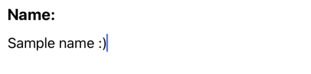
Single line:
import React, { useState } from 'react';
import LabeledInput from './LabeledInput';

const SampleLabeledInput = () => {
  const [value, setValue] = useState("");
  return <LabeledInput
    label='Name:'
    value={value}
    onTextChange={setValue}
  />

}

export default SampleLabeledInput
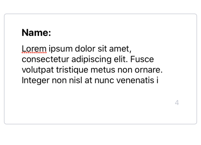
MultiLine:
import React, { useState } from 'react';
import { Card, LabeledInput } from 'nottinderuikit';

const MultilineSampleLabeledInput = () => {
  const [value, setValue] = useState("")
  return <Card>
    <LabeledInput
      label="Name:"
      value={value}
      onTextChange={setValue}
      lines={4}
      max={140}
    />
  </Card>
}

export default MultilineSampleLabeledInput
Props
Reference
label
Label of the input.
| Type | Default | Required |
|---|---|---|
| string | undefined | true |
onTextChange
Function called when the when the text on the input changes.
| Type | Default | Required |
|---|---|---|
| function: (nextValue: string) => void | undefined | true |
value
Value of the input.
| Type | Default | Required |
|---|---|---|
| string | undefined | true |
lines
Number of lines of the input.
| Type | Default | Required |
|---|---|---|
| number | undefined | false |
max
Max length of input's value
| Type | Default | Required |
|---|---|---|
| number | undefined | false |