
LabeledRadioButtons
Simple radio buttons group
Usage
import React from 'react';
import { LabeledRadioButtons } from 'nottinderuikit';
const SampleLabeledRadioButtons = () => {
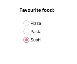
const options = [{ value: '1', label: 'Pizza' }, { value: '2', label: 'Pasta' }, { value: '3', label: 'Sushi' },];
const handleChange = (option: { value: string, label: string }) => {
console.log(option);
}
return <LabeledRadioButtons label='Favourite food:' options={options} onChange={handleChange} />
}
export default SampleLabeledRadioButtons
Props
Reference
label
Label of the radio buttons group.
| Type | Default | Required |
|---|---|---|
| string | undefined | true |
options
Array of objects with the shape {value:"", label:""}, those objects will define the diferents radiobuttons.
The value is a non user visible string, and the label is shown on the right of the radiobutton
| Type | Default | Required |
|---|---|---|
| Array: {value:string, label:string}[] | undefined | true |
onChange
Function executed when the selected radiobutton changes.
| Type | Default | Required |
|---|---|---|
| function: (option:{value:string, label:string}) => any | undefined | false |
defaultSelectedValue
Value of the option we want to select by default
| Type | Default | Required |
|---|---|---|
| string | undefined | false |